Chapter 12
CLASS IX
(NCERT)
CHAPTER 12: STATISTICS
12.1 Introduction
- Statistics- It is a study of data.
- Data- Individual pieces of factual information used for
analysis.
- Graph- Diagram of data, which makes understanding easier.
It has axes. Here, we are only talking about graphs with two axes, one
horizontal axis named as X axes and vertical axes as Y axes.
As
we studied earlier, data can be represented in the form of tables. Suppose we have a data of score of 20 students in mathematics exam.
Marks obtained: 10, 11, 15, 16, 20
No.of
students: 6, 2, 4, 5, 3
We will tabulate this
as,
|
Mark
obtained |
No. of students (Frequency) |
|
10 |
6 |
|
11 |
2 |
|
15 |
4 |
|
16 |
5 |
|
20 |
3 |
After this tabulation, we
can do further calculations like mean, median, mode, etc.
Instead of this tabulation, we can make use of
another form of representation, known as, graphical representation.
12.2 Graphical Representation of Data
Graphical representation of data is a mode of
representing the data in the form of graphs. There are three types of data
which we are going to learn in this chapter. They are.
·
Bar graphs
·
Histograms
·
Frequency
polygons
Bar graphs
-
These are graphs
with bars.
-
Bars are those
which can be drawn vertically or horizontally.
-
It should be a
closed figure.
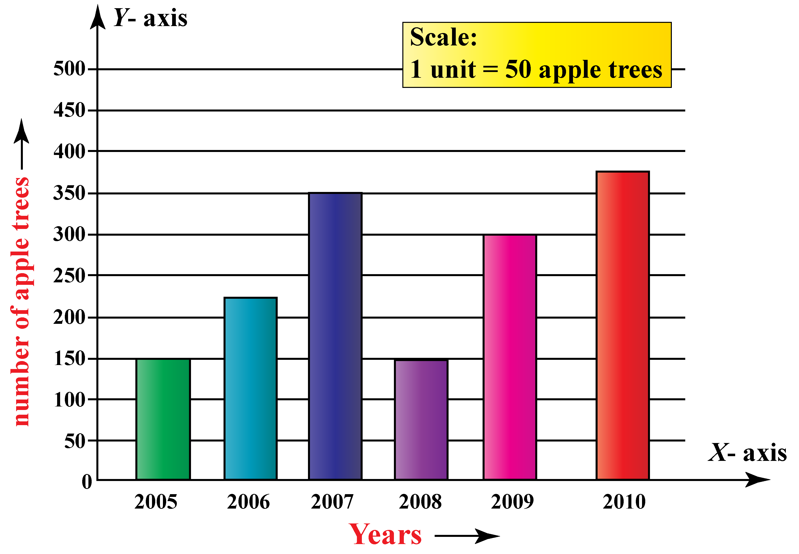
Suppose we want to
graphically represent a data, we will give the frequency, that is, no of apple
trees as vertical axis and years as horizontal axis.
|
X axis |
Years |
2005 |
2006 |
2007 |
2008 |
2009 |
2010 |
|
Y axis |
No of apple trees |
150 |
225 |
350 |
150 |
300 |
375 |

Histograms
-
It is a graph
that shows the frequency of numerical data using rectangles.
-
Similar to bar
graphs, these also have horizontal and vertical axis.
-
These are drawn
by touching the side of each rectangle.
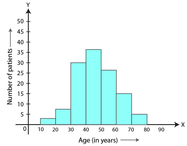
For example, if we want
to draw a histogram of patients in a hospital within an age group as shown
below,
|
X axis (Age) |
10-20 |
20-30 |
30-40 |
40-50 |
50-60 |
60-70 |
70-80 |
|
Y axis (No of patients) |
3 |
7 |
30 |
36 |
27 |
15 |
5 |

Frequency
polygon
-
It is a line graph of class frequency
plotted against class midpoint.
-
It is similar to histogram; the only
difference is that frequency polygon contains line drawn by connecting the
midpoints of the histogram bars.
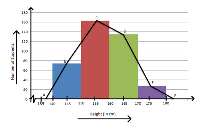
Examples, to plot the frequency polygon of height of
students in a class, take the height as horizontal x-axis and no of students as
vertical y-axis.
|
x-axis (height) |
140-150 |
150-160 |
160-170 |
170-180 |
|
y-axis (no
of students) |
75 |
162 |
135 |
25 |
Plot the
histogram, mark the midpoint of each bar and connect those points with a scale,
as shown below.

12.3
Activities
Q.1 A family with a monthly income of ` 20,000
had planned the following expenditures
per month under various heads:
|
Heads |
Expenditure (in hundred
rupees) |
|
Grocery |
4 |
|
Rent |
5 |
|
Education of
children |
5 |
|
Medicine |
2 |
|
Fuel |
2 |
|
Entertainment |
1 |
|
Miscellaneous |
1 |
Draw a bar
graph for the data above.
Q.2
Construct a histogram of the following data
|
Weight (in kg) |
31-35 |
36-40 |
41-45 |
46-50 |
51-55 |
56-60 |
|
No of students |
9 |
6 |
15 |
3 |
1 |
2 |
Q.3
a) Draw a
frequency polygon for the above data (Q.2)
b) Construct a histogram for Q.1 and draw the frequency polygon.


Comments
Post a Comment